When your logo moves from screen to printing, embroidery, signage, or promotional products, it doesn’t always behave the way you expect.
Many organizations encounter this challenge when preparing logos for printing, embroidery, signage, or branded merchandise. A logo that looks perfect on a website may appear slightly different when stitched onto uniforms, printed on signage, or applied to promotional items. Understanding how logo printing and embroidery processes affect color, size, and detail is the first step toward maintaining consistent brand presentation.
At Feury Image Group, we help organizations maintain logo color consistency across printing, embroidery, signage, and custom apparel decoration. Because brand consistency isn’t automatic — it’s engineered.
We asked our Creative Director, Jennifer Hagen, what determines whether a logo will reproduce accurately in the real world—and how organizations can prepare their logos for production. Here is what she shared with us.
It Starts with the Logo Itself
When a client submits a logo for printing or embroidery, Jennifer evaluates more than appearance.
“I look at the complexity of the design, the clarity of the fonts and words, the thickness or thinness of lines, the colors used, and how accurately the logo will be rendered through different processes like digital print, surface print, screen print, embroidery, and DTF,” said Jennifer.
Thin lines that look sharp on screen may disappear in thread, Jennifer explained. Small type can blur in screen printing. Highly detailed artwork may not translate well to embroidery.
For successful logo printing and embroidery, artwork must be more than attractive; it must be adaptable.

Feury Image Group Creative Director Jennifer Hagen evaluates how logos will perform across printing, embroidery, signage, and promotional products.
Materials and Surfaces Change the Outcome
One of the biggest misconceptions about branding is assuming color will look identical everywhere.
It won’t, says Jennifer.
Fabric absorbs ink differently than coated paper. Vinyl reflects light differently than metal.Texture affects how color is perceived.
And then there’s embroidery. “Embroidery is a different animal altogether,” she said. “Thread introduces texture, dimension, and sheen. That affects how brand colors appear compared to flat ink.”
Understanding how different surfaces impact logo color consistency is essential, says Jennifer, when your brand spans uniforms, signage, vehicles, and printed materials, especially when working with experienced signage and print installation services.
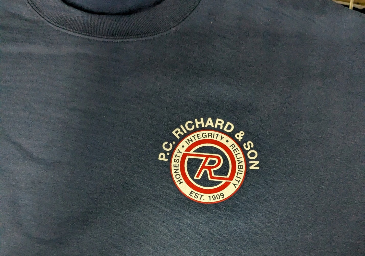
This logo, reproduced on apparel using heat-applied decoration, demonstrates how materials, texture, and production methods can influence how brand colors and details appear.
Size and Placement: The Most Common Mistake
According to Jennifer, improper logo sizing is one of the most frequent production issues. For mostembroidered apparel on branded uniforms:
- Standard left chest logos are typically 3–4 inches wide
- Minimum letter height should be approximately ¼ inch
Jennifer explains:
“A logo that is very horizontal in nature may need to be enlarged to ensure the height of the letters is acceptable, but enlarging it enough may lead to a very wide logo; one that is too wide for the garment.”
Promotional products create even tighter constraints.
Pens, golf balls, and small tools have extremely limited imprint areas. Reducing a full logo into those spaces often makes it illegible.
In those cases, her recommendations include:
- Using a simplified version of the logo
- Isolating a recognizable element
- Creating alternate artwork designed specifically for small imprint areas
Why Pantone Color Matching Matters
Another problematic concern: color inconsistency weakens brand credibility.
Most professional printers and manufacturers rely on the Pantone Matching System (PMS) to ensure consistent reproduction across different processes and materials.
“When logos are supplied without a Pantone color, it’s difficult to ensure accuracy between different printing and embroidery processes,” shared Jennifer. “Without defined Pantone values, color becomes guesswork and guesswork leads to inconsistency.”
For organizations investing in uniforms, signage, promotional products, and multi-location branding, defined PMS colors are critical for maintaining brand consistency across print and apparel.
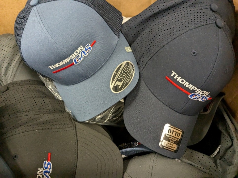
Compared to flat ink printing methods, embroidery adds texture and dimension to a logo, subtly changing how colors and fine details appear on apparel.
Protecting Brand Consistency Across All Applications
When your logo appears on:
- Custom apparel decoration
- Screen printing and embroidery
- Promotional products
- Large-format signage
- Vehicle graphics
- Corporate print materials
You need more than a single logo file. In fact, for companies anticipating multiple uses of their logo, Jennifer recommends:
- Defined Pantone colors
- Secondary or alternate logo versions
- Vector-based master artwork
- A documented brand standard guide
When these elements are in place, Jennifer is confident a brand can scale across apparel, print, signage, and promotional products without losing its integrity.
If Your Logo Wasn’t Designed for Production
Many logos are originally designed for digital use and not for embroidery or large-format signage. That doesn’t mean they can’t work. In fact, almost every day, Jennifer helps clients:
- Define or refine Pantone colors
- Select thread and ink equivalents based on PMS values
- Adjust line weights for embroidery durability
- Create alternate logo lockups for signage or promotional use
These efforts help ensure a brand performs consistently across every surface.
Frequently Asked Questions About Logo Printing and Embroidery
Why do logos look different when printed or embroidered?
Logos can appear different when printed or embroidered because each production method interacts with materials differently. Ink sits on the surface of paper or vinyl, while embroidery uses thread that adds texture and dimension. Pantone color matching, logo size, stitch density, and fabric type can all influence how colors and details appear.
Why does my logo look different when embroidered?
Embroidery uses thread rather than ink, which introduces texture, dimension, and light reflection that can subtly change how colors appear. Stitch density, thread type, and fabric texture can also affect how details and color tones are perceived.
What file format works best for logo printing and embroidery?
Vector files such as AI, EPS, or high-resolution PDF formats work best for logo printing and embroidery because they can scale cleanly without losing detail. Vector artwork ensures logos reproduce accurately across apparel, signage, and promotional products.
The Production Lens Makes the Difference
A logo isn’t just artwork. It’s a system that must function across multiple decoration methods and materials.
Jennifer advises evaluating your logo through a production lens—considering Pantone color matching, embroidery sizing rules, imprint areas, and material behavior.
“That’s how you protect your brand investment,” she says. “Because how your logo looks in the real world matters just as much as how it looks on screen.”
When those factors are considered early, organizations avoid costly surprises and ensure their logo printing and embroidery projects maintain consistent brand appearance across apparel, signage, promotional products, and print.
Have a Question or Project in Mind?
Feury Image Group helps organizations with managed uniform programs, branded apparel, print, signage, and promotional programs across multiple locations.
Let’s connect and start a conversation.